
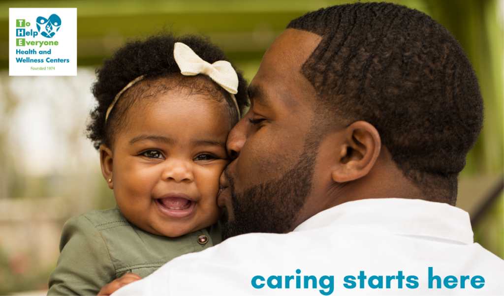
In 2015, I developed a brand campaign for a federally qualified health center in Greater Los Angeles built around a single insight: care carries two meanings simultaneously — healthcare services and genuine human concern. For a primary medical home, both were equally true.
The result was “Caring Starts Here” — a tagline that became a full brand platform.
The architecture was modular by design. The umbrella campaign anchored broad, organization-wide messaging, while service-specific variations branched naturally from the same root: Better Vision Starts Here for optometry, Healthier Smiles Start Here for dental, Healing Starts Here for substance use recovery support, and across nearly 20 service lines in total.
What made it last wasn’t luck. The tagline was specific enough to be credible and open enough to be flexible. It traveled across social media, print collateral, branded merchandise, and video end cards. Design trends changed over eleven years — the phrase held up in every iteration.
The visual language was equally intentional: strength-based imagery reflecting Greater Los Angeles communities across cultures, ages, and relationships. People in moments of genuine emotional connection, not clinical distance.